This post follows the R : Exploring Data for Machine Learning Modeling post, exploring linear model in the context of machine learning.
We'll still use the Wage dataset from the ISLR package.
This dataset reports wage and other data (age, education, jobclass, etc.) for a group of 3000 male workers in the Mid-Atlantic region.
Linear Model
We build a training and testing set (50% of the Wage dataset each):
library(ISLR)
data(Wage)
library(caret)
intrain <- createDataPartition(y = Wage$wage, p = 0.5, list = F)
training = Wage[intrain, ]
testing = Wage[-intrain, ]
We'll fit a linear model on the training set with wage as outcome and age, jobclass and education as predictors:
fit <- train(wage ~ age + jobclass + education, method = "lm", data = training)
final <- fit$finalModel
print(fit)
## Linear Regression
##
## 1501 samples
##   11 predictor
##
## No pre-processing
## Resampling: Bootstrapped (25 reps)
## Summary of sample sizes: 1501, 1501, 1501, 1501, 1501, 1501, ...
## Resampling results
##
##   RMSE      Rsquared   RMSE SD  Rsquared SD
##   34.28111  0.2566582  1.43661  0.03048721
##
##
Diagnosis plots
Residuals vs fitted
Plotting residuals by the predictions (the fitted values) in the training set against the residuals, ie. amont of variation left over after the model fit.
plot(final, 1, pch = 19, cex = 0.5, col = "#00000010")
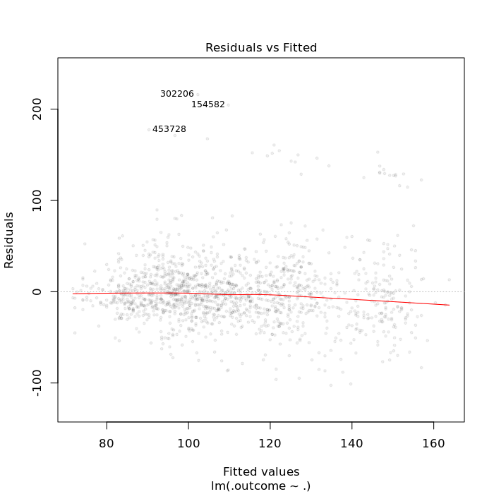
The red line should be centered at 0 on the y-axis (since it represents the difference between the real values and the fitted values).
Outliners labeled at the top of the graph should be explored further for identifying explanotary variables.
We can then using colors for coloring a variable not used in the model to help spotting a trend in that variable.
qplot(final$fitted, final$residuals, color = race, data = training)

We see in the graph above that some of the outliners might be explained by the race variable.
Plots by index
Plotting residuals vs index (ie; row numbers) can be helpful in showing missing variables.
Residuals should not have relationship to index (ie. order of observations).
plot(final$residuals, pch = 19, cex = 0.5)
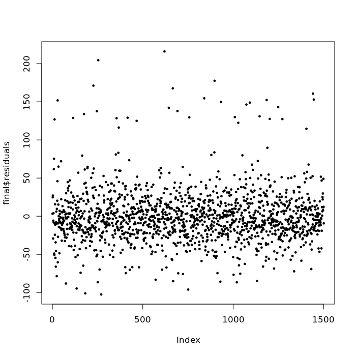
We're looking for residuals appearing at higher or lower rows and/or trends with respect to row numbers, suggesting there is a variable missing from the model, some continuous variable that the rows are ordered by (tipycally a variable expressing a relationship with respect to time or age).
Predicted vs real values plot
Plotting wage variable in the test set vs the predicted values in the test set.
pred <- predict(fit, testing)
qplot(wage, pred, color = year, data = testing)
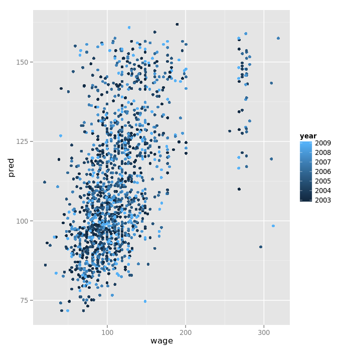
Ideally, these varaible are close to each other and there is a straight line on the 45° line.