These are my notes on the Practical Machine Learning course (Week2: Plotting Predictors - Tutorial).
When exploring data for Machine Learning, we're looking for:
- imbalance outcomes/predictors
- outliners
- groups of outcome points not explained by any of the predictors
- skewed variables (that needs to be transformed)
We'll use the Wage dataset from the ISLR package.
This dataset reports wage and other data (age, education, jobclass, etc.) for a group of 3000 male workers in the Mid-Atlantic region.
library(ISLR)
data(Wage)
summary(Wage)
##       year           age               sex                    maritl           race
##  Min.   :2003   Min.   :18.00   1. Male  :3000   1. Never Married: 648   1. White:2480
##  1st Qu.:2004   1st Qu.:33.75   2. Female:   0   2. Married      :2074   2. Black: 293
##  Median :2006   Median :42.00                    3. Widowed      :  19   3. Asian: 190
##  Mean   :2006   Mean   :42.41                    4. Divorced     : 204   4. Other:  37
##  3rd Qu.:2008   3rd Qu.:51.00                    5. Separated    :  55
##  Max.   :2009   Max.   :80.00
##
##               education                     region               jobclass               health
##  1. < HS Grad      :268   2. Middle Atlantic   :3000   1. Industrial :1544   1. <=Good     : 858
##  2. HS Grad        :971   1. New England       :   0   2. Information:1456   2. >=Very Good:2142
##  3. Some College   :650   3. East North Central:   0
##  4. College Grad   :685   4. West North Central:   0
##  5. Advanced Degree:426   5. South Atlantic    :   0
##                           6. East South Central:   0
##                           (Other)              :   0
##   health_ins      logwage           wage
##  1. Yes:2083   Min.   :3.000   Min.   : 20.09
##  2. No : 917   1st Qu.:4.447   1st Qu.: 85.38
##                Median :4.653   Median :104.92
##                Mean   :4.654   Mean   :111.70
##                3rd Qu.:4.857   3rd Qu.:128.68
##                Max.   :5.763   Max.   :318.34
##
Building training and testing sets (50% of the Wage dataset each):
library(caret)
intrain <- createDataPartition(y = Wage$wage, p = 0.5, list = F)
training = Wage[intrain,]
testing = Wage[-intrain,]
The exploration is always done on the training set.
Plotting predictors against outcome
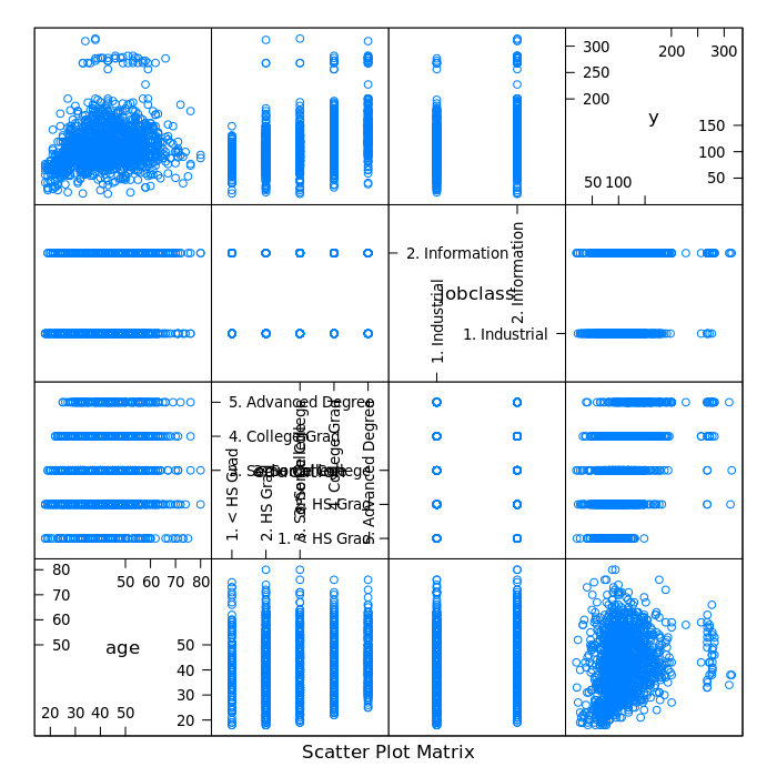
Plotting wage versus age, education and jobclass using the R featurePlot function (from the caret package):
featurePlot(x = training[, c("age", "education", "jobclass")], y = training$wage, plot = "pairs")
Plotting wage versus age:
library(ggplot2)
qplot(age, wage, data = training)
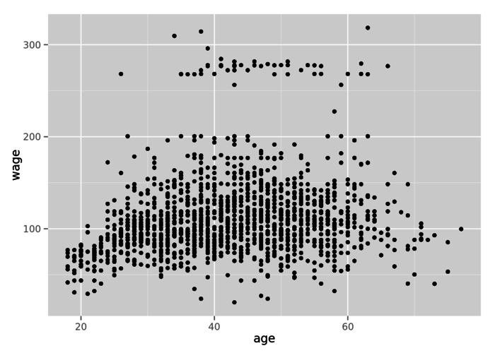
The graph shows some patterns: a trend in wages comparing to ages and a group of outlined observations (above 250 dollars raw wage).
Plotting wage versus age, grouping by jobclass:
library(ggplot2)
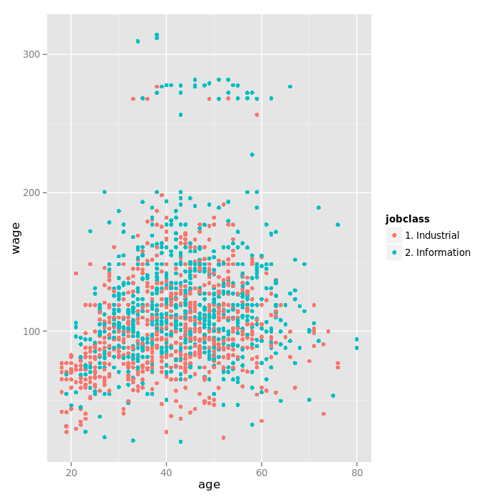
The jobclass difference could explain the two distinct groups.
The jobclass variable might be able to predict at least a part of the variability that appears in the top of the plot.
Plotting wage versus age, grouping by education, adding regression smoothers:
qq <- qplot(age, wage, color = education, data = training)
qq + geom_smooth(method = "lm", formula = y ~ x)
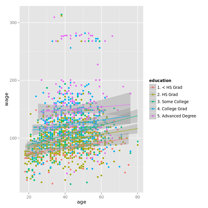
The "Advanced Degree" education seems to also explained a lot of the variation at the top.
Data Repartition
Breaking up the wage variable into three groups (factors actually) with the R cut2 function (from the Hmisc package):
library(Hmisc)
cutWage <- cut2(training$wage, g = 3)
table(cutWage)
## cutWage
## [ 20.1, 91.7) [ 91.7,118.9) [118.9,314.3]
##           506           519           476
Looking at the repartition, we can see that there are more industrial jobs that there are information jobs with lower wage. Then the trend reverses itself.
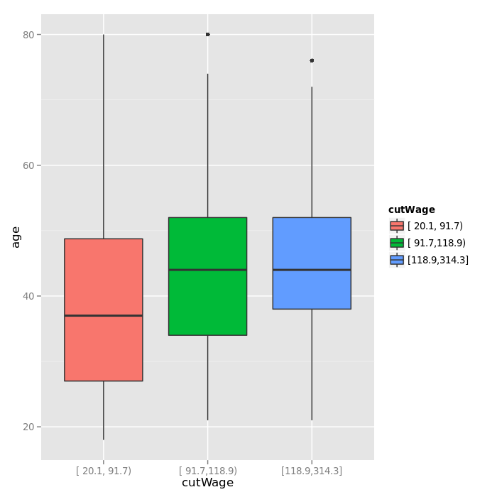
Plotting a boxplot of the wage groups created above:
qplot(cutWage, age, data = training, fill = cutWage, geom = c("boxplot"))
Exploring the repartition of jobclass across wage groups:
t1 <- table(cutWage, training$jobclass)
t1
##
## cutWage         1. Industrial 2. Information
##   [ 20.1, 91.7)           313            193
##   [ 91.7,118.9)           262            257
##   [118.9,314.3]           190            286
Using the prop function to get the proportion of jobclass (in each row) for each groups:
prop.table(t1, 1)
##
## cutWage         1. Industrial 2. Information
##   [ 20.1, 91.7)     0.6185771      0.3814229
##   [ 91.7,118.9)     0.5048170      0.4951830
##   [118.9,314.3]     0.3991597      0.6008403
62% of the low wage job correponds to industrial jobs, 38% to information jobs.
Density Plots
Density plot can be a much more effective way to view the distribution of a variable than boxplots.
Plotting a density plot of the values of wages, grouping by education:
qplot(wage, color = education, data = training, geom = "density")
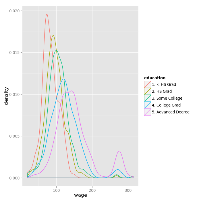
The "<HS grad" workers tend to have more values in the lower part of the range of wage. There is an outgroup of Advanced Degree and College Grad workers with higher wage.
In the next post, we'll fit a linear model with wage as outcome and age, jobclass and education as predictors and perform some diagnosis analysis.